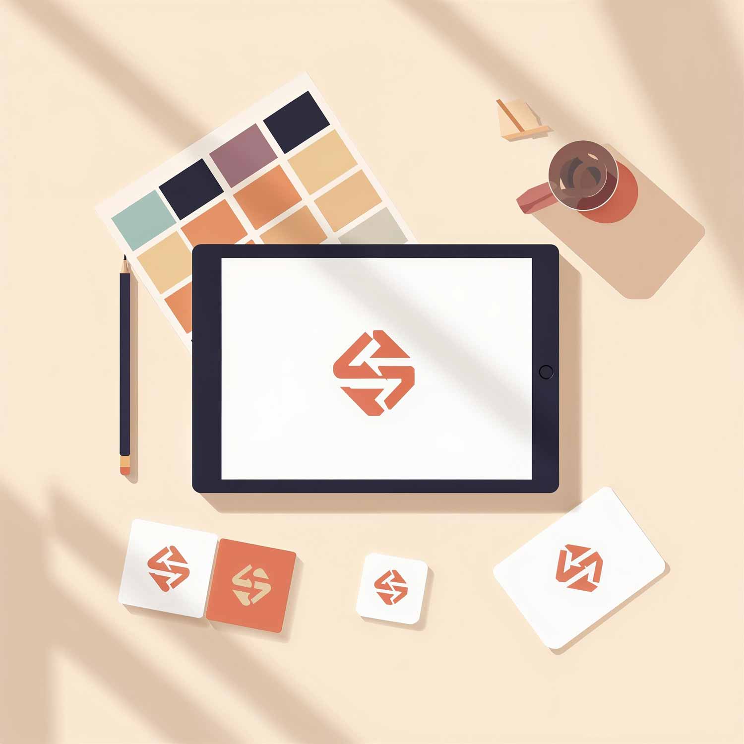
Ask most small business owners what a logo does, and you'll get some version of the same answer: it's the thing that goes at the top of the website, on the business cards, maybe on a sign above the door. True enough, but it undersells the job the logo is doing every time someone sees it.
A logo is the fastest piece of communication your business owns. Before a customer reads a word of copy or scrolls past a single product, they've already formed an impression from that small mark alone. Whether that impression works in your favour depends on choices most people never think to question.
It's doing work long before anyone reads your name
Recognition happens faster than reading. Someone can spot a familiar logo shape and colour from across a room before their brain has even processed the letters. That split-second recognition is valuable because it means your brand doesn't need a sentence of explanation to register. It just needs to look like itself, consistently, wherever it turns up.
This is why a logo that changes shape, colour, or style depending on where it's used causes more damage than people expect. A slightly different version on Instagram, a stretched or squashed one on the website, a low-resolution copy pasted into an email signature. Each version chips away at the recognition you're trying to build.
It sets expectations before anyone reads a word
A logo carries tone in the same way a person's posture does. Sharp, geometric shapes tend to say something different to soft, rounded ones. Bold, saturated colour says something different to a muted, pastel palette. None of this is accidental when it's done well, and it's rarely accidental when it's done badly either; it's just been left to chance.
A holiday letting agency and a legal practice shouldn't be reaching for the same visual language, even if both are perfectly competent businesses. Customers form quiet assumptions about price, professionalism, and personality from a logo alone, often before they've read a single line about what you offer.
It has to survive being small, being mono, and being stretched
A logo that looks fantastic as a large image on a homepage banner can fall apart the moment it needs to work at the size of a favicon or printed on a pen. Fine detail disappears, thin lines vanish, and text becomes an illegible smudge. Testing a logo at a small size and in a single colour tells you far more about its real-world durability than seeing it blown up large ever will.
This matters more than most business owners realise because a logo rarely gets used just once, in one ideal setting. It ends up on invoices, social profiles, van signage, packaging, and a dozen contexts nobody planned for when the design was first approved.
It needs to age well, not just look current
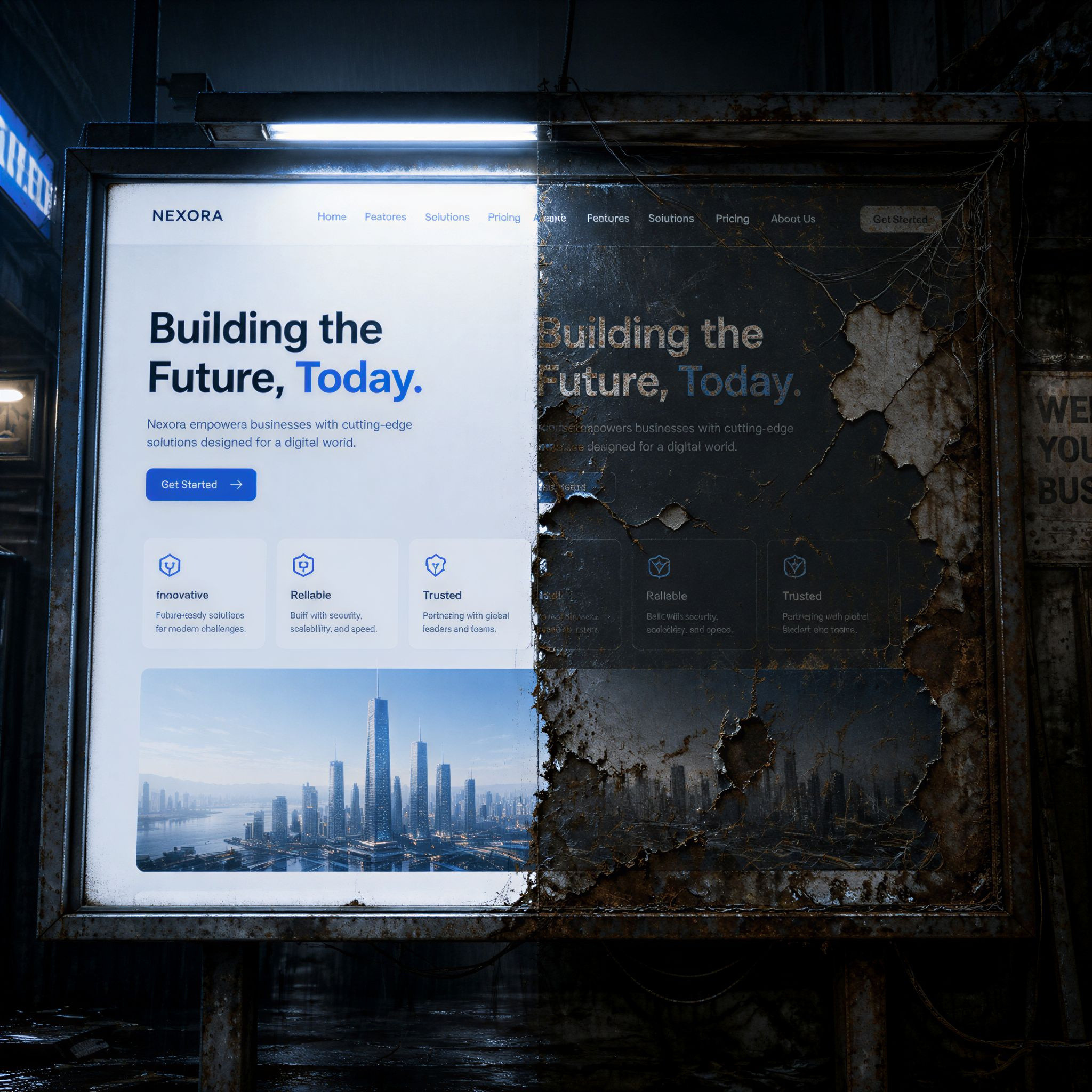
Trend-driven design dates quickly. A logo built entirely around a colour gradient or font style that's fashionable this year can look distinctly of its time within a couple of years, and redesigning a logo too often undoes the very recognition it's meant to build. The strongest logos borrow a little from current design sensibility without leaning on it entirely, which is part of why so many long-standing brands still look broadly similar to how they did a decade or two ago.
Getting it right from the start
None of this means a logo has to be complicated. Some of the most effective ones are strikingly simple, a single shape or a cleanly set piece of type. What matters is that the simplicity is intentional rather than an afterthought, and that it's been designed with actual use in mind rather than just how it looks on a design brief.
If your current logo was knocked together quickly, inherited from an old business name, or hasn't been looked at since the business first opened its doors, it might be quietly working against you without anyone noticing. A short conversation with someone who designs for a living is often all it takes to find out whether it's helping or holding you back.